Museum of Fine Arts: Art of the Americas wing

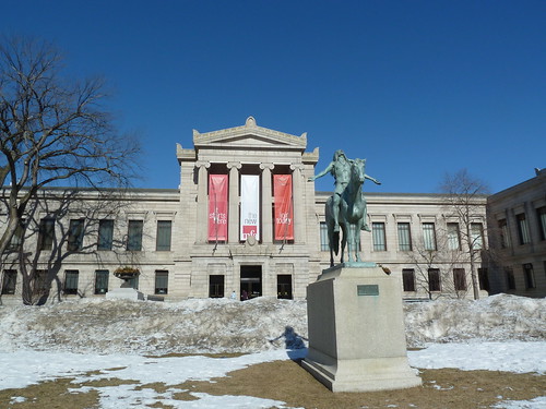
After reading much about the recently-opened Art of the Americas wing of the Museum of Fine Arts in Boston, I finally paid a visit and was quite impressed. I’m not a frequent visitor to the MFA and in the past, I spent more time keeping track of the students I was chaperoning than I did admiring the art work, but I’d been there often enough to know that it’s a confusing place to navigate. Not anymore. Under construction for more than six years, the new wing not only adds 120,000 square feet of new space, it changes the entire layout of the museum. Instead of coming in through the west side from the parking lots, all visitors must enter from either Huntington Avenue (the original main entrance, shown above) or the Fenway side (opposite the main entrance).
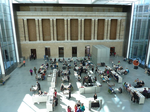
The Huntington Ave entrance is flanked on the left by the Art of Asia, Oceania and Africa section and on the right by the Art of the Ancient World (which is contained in the George D. and Margo Behrakis Wing). Straight ahead along The Fenway is the Art of Europe. When you venture to the midway through this entrance-to-entrance hallway, however, you soon find off to your right an enormous atrium, an enclosed-in-glass courtyard that is 64 feet high and contains 12,000 square feet of space. Walking through this space which houses the “New American Cafe” (shown below), you enter the newly constructed Art of the Americas wing.
Not only is this part of the building new, the approach to displaying the artwork is novel for the MFA. As you ascend the four floors of this space, the art is installed chronologically with Ancient American, Native American and 17th-Century on the ground floor, the 18th-Century on Level 1, the 19th-Century on Level 2, and the 20th-Century on Level 3. In all the spaces, dissimilar works ranging from paintings to furniture to sculpture to textiles to artifacts are all grouped together, creating a synergistic collection for each period. Unlike the hard-to-follow nooks and crannies of the older portions of the museum, this new wing is rationally laid out and easy to follow. One terrific architectural feature is the separation of the galleries from the east elevation of this new section (the wall that faces downtown Boston) by glass enclosed walkways that allow a visitor to step into the sunlight for a moment before plunging into the next gallery.
From prior visits, I know that there’s some amazing items in the other parts of the museum, but all our time this trip was spent in the Art of the Americas Wing. It was a great way to spend the day.

We went to the MFA this past Monday.Art of Americas seemed to be a museum within a museum. I would suggest if you have time one should take time to just visit the Art of Americas. You will be there for hours.
The people visiting that I spoke with at the museum, compared Art of Americas wing to the Whitney Museum of American Arts in New York City.
I live right across the street, in the large 16-story glass tower, and I haven’t been since the remodel was completed. I know that admission is free for (most) college students, so there can’t be much more incentive to check it out.